Category: Uncategorized
-
Railway Coffee + Downtown Ruston
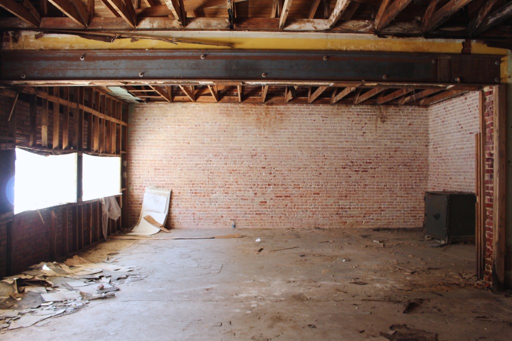
Independent, Small Batch, Specialty Coffee + A Blank Slate Building in the heart of Downtown We can’t imagine a better combination! ————————————————————————– We are thrilled to announce that Hunt & Gather Home will be working with Railway Coffee to bring to life a storefront roasting facility in Downtown Ruston, Louisiana! Brick walls, exposed beams, raw…
