Happy Thursday! Thanks for all the Facebook feedback after my last post. Grey is such a popular color and it’s fun to hear what shades all of you have chosen for your own homes. Two colors many of you mentioned were also colors I’d considered for our living room: Chelsea Gray and Revere Pewter (both Benjamin Moore).
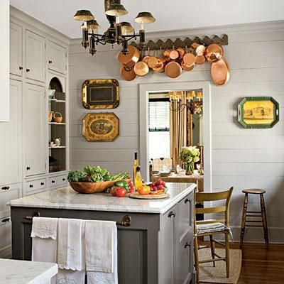
(via Southern Living)
I’ve had the above photo pinned for quite some time now. I just love the deep warmth of the lighter gray walls (Revere Pewter) as it contrasts with the island (Chelsea Gray). Both colors give off a vintage vibe and I love that they pair well with a variety of accent materials such as copper, oil-rubbed bronze, natural wood, gold, silver, and marble.
Knowing Chelsea Gray was darker than I desired, I choose to start my paint search with Revere Pewter. I’d heard so many great things about the color, I was sure it would be perfect before I even opened the sample can. This would be the easiest paint choice ever.
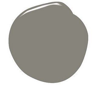
Chelsea Gray
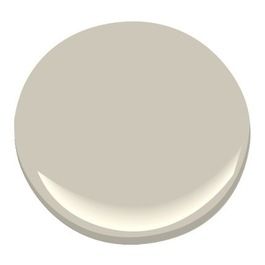
Revere Pewter
Wrong. I loved Revere Pewter when I first painted it on our walls, but as it dried, it got much darker than I desired. Still a lovely color, but not what I was going for. After seeing Revere Pewter on the wall and observing the contrast between trim and wall color, which was greater than I expected, I knew I’d need to go lighter than I thought to obtain the seamless look I wanted. I took a second look at my inspiration pins and realized the wall color was barely darker than the trim, so I headed to Lowe’s and Home Depot to look for a paint color that would fade gently into the background and let my furniture make a statement. With more direction and focus, I grabbed a handful of light gray paint color cards even crossing over into the tinted white color section. When I got home, I held each color up against the trim in various location in my dining and living rooms, easily crossing out all but two options. I set those two cards on the edge of my dining room table and left them there for a week so that I could monitor them at various times of the day to make sure they worked in all kinds of light.
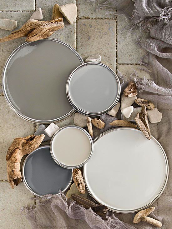
I also searched online and found the following colors that helped guide me to the right shade and intensity:
Cloud Nine (Benjamin Moore)
While I monitored my paint cards and pondered over Pinterest recommendations, I made one last-ditch effort to make Revere Pewter work. I took it to my local Sherwin Williams store and had them lighten it by 75% by adding white to the original color. Again, I came home, sure that I had made the world’s best paint color even better, but again was not pleased with the results when I painted it on my walls. It just looked purple.
By this time, I was starting to warm to one of the colors that had been sitting on my dining room table for the past week: Silver Birch by Glidden, picked up hastily at Home Depot.

Silver Birch, Glidden
I decided I liked it enough to buy a sample. When I painted it on my walls, it looked nearly white, but as it dried, it took on a subtle warm-grey tint that just slightly contrasted with the trim. I let it dry fully and then continued to monitor how it looked in the morning, noon, and afternoon light, and most importantly in the evening with artificial lighting. I was pleasantly surprised that I loved the color variations throughout the day. As different light hit the wall, Silver Birch ranged from a white to a warm grey, but never took on yellow undertones. Sold!

The physical work of painting lies ahead of us, but the hard part of choosing a color is done! If there’s anything I learned from choosing a color, it’s that natural lighting makes all the difference. What works in one home might not in another simply due to lighting. The paint-card-on-the-table was a great trick that worked well for me. It required some patience, but it really helped me to see how paint colors varied throughout the day before I purchased and painted a sample on my wall.
I can’t wait to show you the final results of the room. We’re planning a paint party within the next few months – anyone care to join us?
